

Watermark settings explained, with screenshots
An illustrated reference to every text, image, placement, tiling, shadow and page-scope control in the online Word watermark editor.
Use this reference while working in Add watermark or Edit watermark. The screenshots show the real English-language editor, cropped to the relevant controls. Your screen may arrange them differently on a phone, but the settings mean the same thing. Start with the complete workflow if you have not uploaded a file yet.
Each question-mark icon opens a short explanation. A slider is useful for comparing visual changes; where a numeric value is shown, you can enter an exact value. Dimensions and offsets use points: 72 pt equals one inch. Values shown in the screenshots are examples, not mandatory settings.
Choose the mode and type
Standard uses Word's standard watermark mechanism. It is a good choice for a simple text label or a centered picture. The saved set can contain one standard watermark; edit that item to change it. Custom creates individually configured marks and exposes position, rotation, opacity, repetition and scope. You can combine custom marks within the five-configuration limit.

Choose Text for editable wording or Image for a logo or artwork. These choices are available in both modes. Changing to Image does not turn a standard watermark into a custom one: select Custom separately if you need its additional controls.

Text content and appearance
Watermark text
Type the exact wording you want readers to see. The DRAFT, CONFIDENTIAL and COPY buttons replace the text with a common label; they do not submit the form. Short wording is easier to keep legible across a page. Standard text allows up to 200 characters. Proofread before saving, especially names and document identifiers.

Font
Open the font dropdown and search by family name. Common families appear first, followed by other fonts available to the conversion service. Choose the actual font from the results rather than typing an arbitrary family name. For multilingual wording, select a family that contains the required characters; a Latin-only font may require substitution.

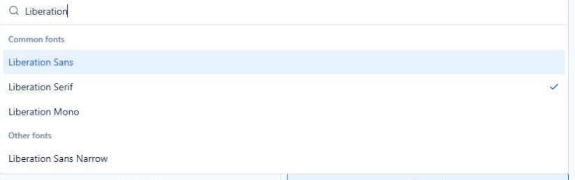
The browser may draw a fallback if that font is not installed locally. The downloaded Word file is the final check; a familiar-looking preview is not proof that every glyph will render identically on another computer.
Color
Open the color control to choose a preset swatch or use the color picker for a custom color. The displayed hexadecimal value identifies the selected color. The initial red is #DC2626; gray is useful for a quieter background label. Color and transparency are separate settings: a pale color can still be opaque.

Font size — Standard text only
Leave Auto selected to let the standard watermark implementation choose its size for the document. Auto is not a fixed point size, so the mark can look different across page dimensions. Disable Auto or move the slider to use an explicit size; the current editor allows 1–65.5 pt in half-point steps. An explicit size is useful when several copies must use the same nominal lettering size.

Layout — Standard text only
Choose Horizontal for level wording or Diagonal for a conventional review stamp. This control offers those two layouts only. To create a vertical mark or choose an exact angle, use Custom mode and its Rotation control.

Semi-transparent — Standard text only
Keep the switch on when the watermark crosses normal paragraphs. Turning it off makes the selected color more solid. This is a simple on/off setting, not a percentage slider. For finer visibility control, choose a custom watermark and adjust Opacity.

Bold and Italic — Custom text only
These buttons change the custom text's emphasis independently. Bold can improve a short label's visibility; italic may suit an annotation but also changes its proportions. Check the preview again after changing the style, particularly when using a narrow watermark shape.

Width and Height — Custom text only
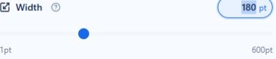
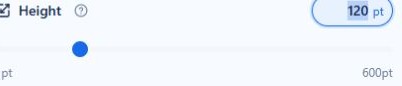
Custom text is drawn inside a shape. Width controls that shape's horizontal extent and Height its vertical extent; neither is the standard font-size setting. The current editor deliberately does not offer Font size for custom text.


Change both dimensions proportionally if you want to make the entire label larger without changing its aspect ratio. For example, changing 300 × 70 pt to 450 × 105 pt preserves the same ratio. Increasing only the width or only the height can stretch the lettering. This is a proportional adjustment, not an automatic measurement of the font.
Image source and size
Choose, replace or remove an image
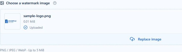
Click the image upload area or drag an image onto it. PNG, JPEG and WebP are accepted up to 5 MiB. Wait for Uploaded before saving. The local thumbnail helps you confirm the selected artwork; Replace image lets you choose another file. Removing the image means you must supply one before saving that image watermark.
Automatic image size — Standard image only
Enable this switch to let the standard watermark implementation size the picture. Disable it to show Image scale. Auto is a sizing choice; it does not remove a white background or alter the artwork's colors.

Image scale — Standard image only
Scale changes both dimensions together. Start at 100%, then reduce the value if the mark overwhelms the page. Image DPI affects the resulting physical size, so 100% does not mean 100% of the page width. The slider provides a convenient working range; the numeric control accepts the supported larger range.

Washout — Standard image only
Washout makes a picture look fainter behind the document. Compare both states if your logo is already pale: washout can make fine lines hard to see. It is not background removal and is not the same as the precise Opacity percentage available in Custom mode.

Image sizing — Custom image only
Choose Original size to use the picture's natural size, Set width or Set height to specify one dimension while preserving proportions, or Set width and height to supply both. Setting both dimensions can distort a logo if the ratio does not match the original image. For most logos, start with Set width.

Custom image adjustments
Expand Image adjustments to reveal the following controls. They change the watermark image, not the uploaded Word document's other pictures. Make one adjustment at a time so you can tell which change improved or weakened the result.
Brightness
Move the slider to lighten or darken the image. Original leaves its brightness adjustment unset; it is different from choosing an arbitrary percentage. Return to Original if the logo loses detail, then adjust opacity separately.

Contrast
Contrast changes the separation between light and dark areas. Strong contrast can make a mark intrusive; very low contrast can remove detail. Use Original to undo this adjustment without resetting size, placement or other image effects.

Grayscale
Turn Grayscale on to remove the image's color. This is useful for a restrained monochrome document, but it does not make the image transparent. Check that differently colored parts of the original remain distinguishable after conversion.

Crop left, right, top and bottom
Each slider removes a percentage from that edge of the image. Use small changes to trim unwanted empty margins. Left plus right must remain below 100%, and top plus bottom must remain below 100%; otherwise no image area would remain. Cropping changes what part of the picture is visible, while Width and Height determine its displayed dimensions.




Custom position and layout
Placement area
Choose Page, Header or Footer as the area used for placement. This is separate from which page types receive the mark. A footer placement is not a command to apply only to the last page; use the scope controls to decide where it repeats.

Alignment
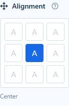
Choose one of the nine positions in the grid. Center is a useful starting point for a large watermark; a corner may work better for a small label. Alignment follows the chosen placement area. Use offsets only after selecting the nearest suitable alignment.
Rotation
Use a preset angle or the slider for a precise rotation. Zero is level; 90° or −90° produces vertical wording. The range is −360° to 360°. Rotation does not shrink a mark to fit the page, so a wide shape can reach the page edge after turning.


Opacity
Opacity controls how visible the custom watermark is: 0% is invisible and 100% is fully opaque. A value around 20–30% is a useful starting experiment for a background logo, not a universal rule. Check dense text, white space and any tables in the downloaded file.

Layer
Behind document text normally suits watermarks. Above document text draws the mark in front and can cover paragraphs or illustrations. If you need the upper layer for a stamp, use a modest size and inspect the output carefully.

Repeat and pattern presets
Choose Single watermark for one mark in each target area, or Tile for a repeated pattern. The 2 × 2, 3 × 3 and 5 × 5 shortcuts set row and column counts together. Tiling is a visual pattern, not protection against removing or copying document content.


Rows and Columns
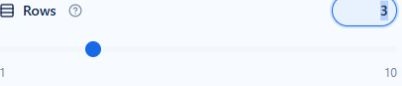
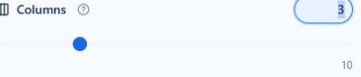
These controls appear when Tile is selected. Each accepts 1–10. A 3 × 3 pattern creates nine marks per target area; more sections and header/footer types multiply that number. The service limits a custom watermark to 1,000 generated shapes across its targets, so reduce density for a heavily sectioned document.
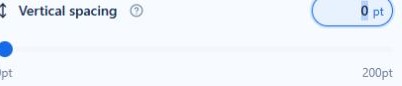
Horizontal and vertical spacing
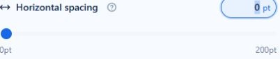
Leave the automatic switches enabled to let the service distribute the pattern. Turn off the relevant switch to set explicit spacing in points. Horizontal and vertical spacing are independent; small spacing combined with a large shape can make neighboring marks overlap.


Custom shadows
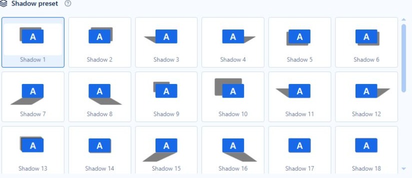
Shadow and preset
Enable Shadow to reveal the visual preset gallery. Select a thumbnail by its geometry rather than assuming its number describes a strength. The gallery is scrollable. The supported presets use hard-edged shadow geometry; this is not a soft CSS blur effect.

Shadow color
Open the color control and choose a preset or custom shadow color. The shadow has its own color, independent of the text or image. A neutral shade usually makes its shape easier to judge while adjusting the preset.

Shadow transparency
This is transparency, the opposite direction to watermark opacity: 0% is solid and 100% is invisible. It is independent of the watermark's own opacity. Image shadows follow the image rectangle rather than tracing the visible logo's outline, so a logo with transparent margins can cast a rectangular shadow.

Precise adjustments
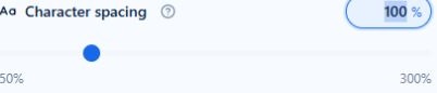
Character spacing — Custom text only
Expand Precise adjustments. A value of 100% keeps normal character spacing; lower values tighten the text and higher values spread it out. The control ranges from 50% to 300%. It changes spacing between characters, not the font size. Recheck shape proportions after a large change.
Horizontal and vertical offset
Offsets move a mark from its selected alignment. Positive horizontal values move it right; negative values move it left. Positive vertical values move it down; negative values move it up. Start with zero and make small changes. Large offsets can place some or all of a mark outside the visible page.


Section and header/footer scope
Expand Section & header/footer scope. The current editor applies custom watermarks across all sections; it does not let you select a section number or enter an arbitrary page range. The dropdown selects header/footer types, which may repeat through a document.

| Choice | Meaning |
|---|---|
| All active types | Apply across the header/footer types used by the document. |
| First-page type in each section | Target each section's first-page type; this is not necessarily only page 1 of the entire file. |
| Except first-page type | Omit each section's first-page type. |
| Primary type | Target the normal type, which also serves odd pages when separate odd/even headers are used. |
| Even-page type | Target the even-page type. |
The relevant first-page or odd/even header structure can be enabled during conversion for the chosen scope. Existing section breaks and linked headers matter. Use Multiple pages to understand the pattern, then inspect the actual Word output; the sample preview cannot discover your uploaded document's structure.
When you are satisfied, select Add watermark or Save changes, review the saved item in Ready to convert, and run conversion. Downloadable examples provide three settings you can reproduce and compare with real output.